Just the Facts, Ma'am

When faced with making important decisions about long-term investments, we want to be confident in our sense that we can predict the future. The truth, however, is that uncertainty is part of life and also a distinct fact of investing in stock markets.
Facts and their vulnerability are the subject of this post. More specifically, we want to address how mathematical functions used to explain potential outcomes can be twisted beyond recognition. To be clear, we are not looking to discuss intentional distortion of the facts, but rather about the flawed inputs to predictions.
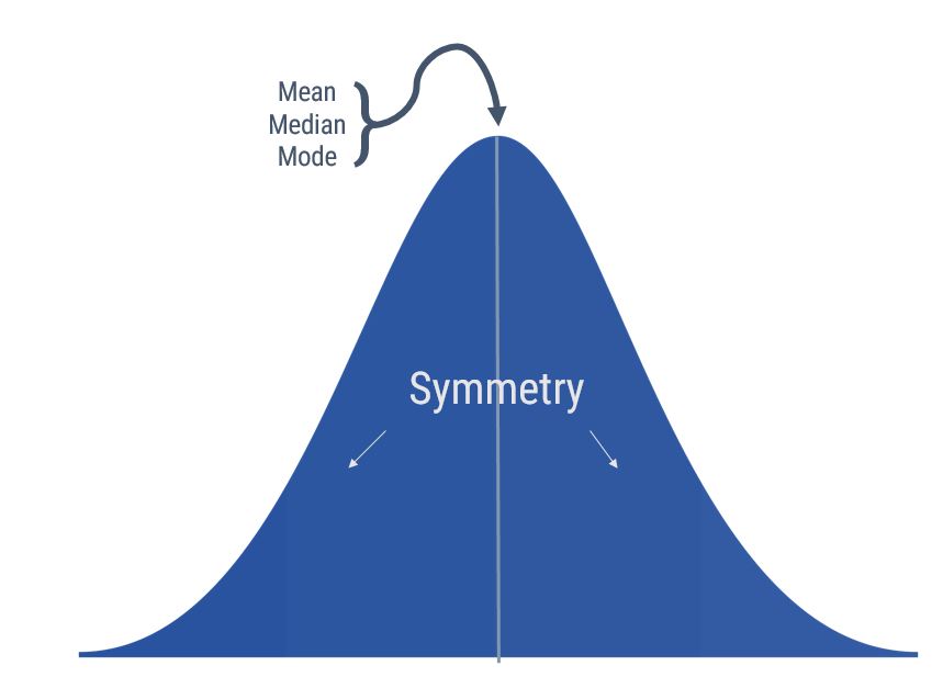
In statistics, the most frequently used function to explain the variability of stock market returns is the normal distribution. Graphically, this distribution is illustrated as the bell-shaped curve shown below. It has an equal amount of variance in observations above and below the mean observation:

The shape of the curve is pleasing to the eye due to its symmetry. Symmetry is balance and balance is good - and predictable. Statisticians have labeled the bell curve a "normal" distribution. So we want to believe this pleasing, predictable distribution explains uncertainty. But let's be honest with ourselves - does it accurately explain the historical pattern of stock market returns?

When we define normal in non-mathematical terms we are describing something that happens or we observe much more frequently than not. If we apply this definition to stock market returns, then what return would we consider normal in any given year? The graph below, with data from a report provided by NYU Stern School of Business, shows the annual return for the S&P 500 Index from 1928-2016. The annualized compound return over this 89-year period was 9.5% per year – that is, an average year returns just under 10%. Right?
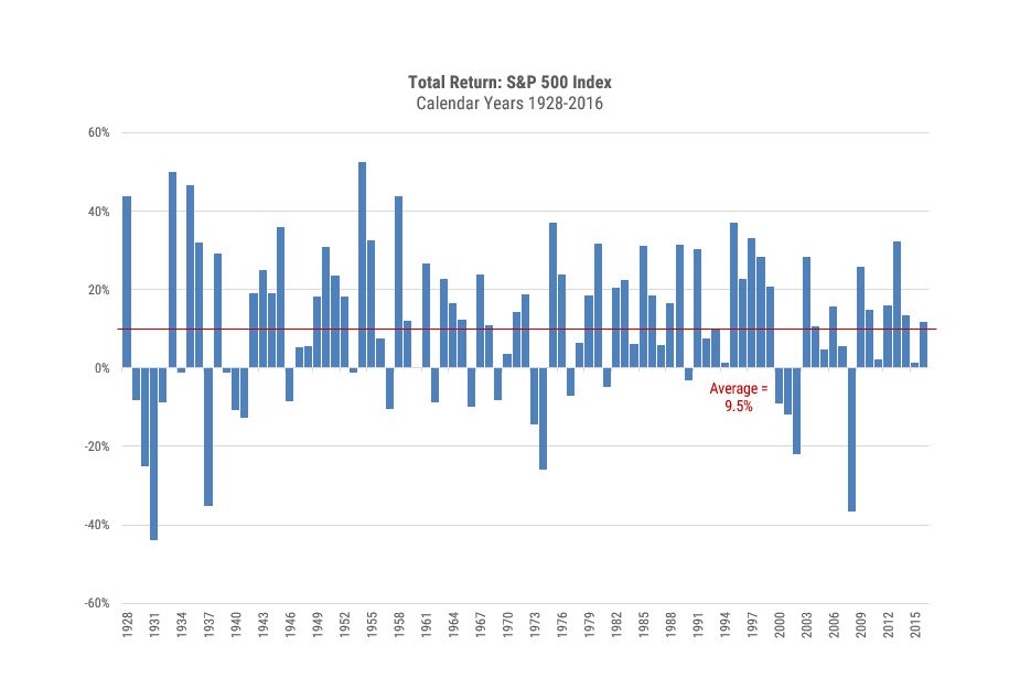
Source: NYU Stern School of Business. Geometric annualized total returns for S&P 500 Index, 1928-2016.
Not exactly. That figure refers to a compound annualized number smoothed out across many periods. This is a simple mathematical function to calculate the return between a beginning and ending value. It should not be taken as the return experienced by a stock market investor in any given year.
Now consider the second graph. This graph illustrates the range of returns – divided into 10% bands - over this same 89-year period - not exactly the smooth bell curve we discussed earlier.
In fact, over this nine-decade period there were more years when the returns were over 30% (17) than between 0 and 10% (15), which is a range we mistakenly label as "normal." Also note that the number of years when the return was 20% or greater (31) was almost three times as much as years when the return was -10% or worse (11).
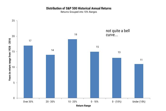
Source: NYU Stern School of Business. Chart captures the numbers of years (1928-2016) with an annualized return that fell into the ranges indicated.
The shape of the second graph introduces another statistical term called skewness, which is much more descriptive of the stock market. Skewness is asymmetry in a statistical distribution and can be measured as being positive, negative or undefined. Positive skewness is when there are more extreme positive observations than there are extreme negative observations. This is a logical explanation of historical market returns, as the total value of stocks is ultimately determined by the growth of the economy and the cumulative impact it has on sales and earnings of individual companies.
The significance of skewness is even more apparent when disaggregating the market return. The contribution made by individual companies comprising the index over any given period is driven by two important factors. One factor is the return difference between stocks, which typically has extremely wide variance over the period measured and is attributable to many economic and company-specific variables. Another important factor is that capitalization bias in indices – that is, many benchmark indexes, such as the S&P 500, place a higher index weight on larger companies by using market value as a determinant for a company’s level of representation in that index.
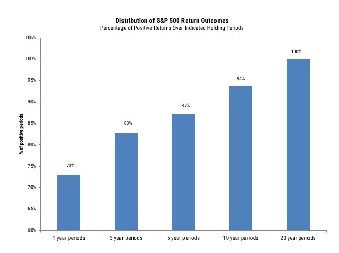
Source: NYU Stern School of Business. Chart shows proportion of return experiences that are positive for the S&P 500, over the periods indicated.
The fact the stock market typically has a positive skewness to returns is illustrated on the next graph. It illustrates the historical generation of positive returns over 1, 3, 5 & 10 year periods since 1928. If positive skewness did not exist there would not be a difference between a positive return across multiple holding periods. In fact, there has been a much higher chance of earning a positive return the longer your holding period. This perspective and the patience that results from this view are essential to capturing the stock market's attractive long term returns.
The final graph and quoted comments below are from a recent research paper on market skewness, published by a professor at Arizona State University. Using data back to 1928, he observed that an large percentage of market returns in any given period is due to a small number of stocks.
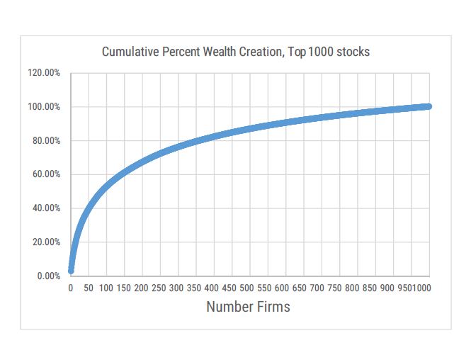
Source: Do Stocks Outperform Treasury Bills? Feb 2017 Hendrik Bessembinder W.P. Carey School of Business, Arizona State University.
Quoting Professor Bessembinder (emphasis added):
“While the overall stock market outperforms Treasury bills, most individual common stocks do not. Of the nearly 26,000 common stocks that have appeared on CRSP since 1926, less than half generated a positive holding period return, and only 42% have a holding period return higher than the one-month Treasury bill over the same time interval. The positive performance of the overall market is attributable to large returns generated by relatively few stocks. When stated in terms of lifetime dollar wealth creation, one third of one percent of common stocks account for half of the overall stock market gains, and less than four percent of 28 common stocks account for all of the stock market gains. The other ninety six percent of stocks collectively matched Treasury-Bill returns over their lifetimes.”
We believe that the positive skewness in returns among individual stocks across most multiple-year holding periods is a strong argument for using index-based strategies. Active managers face a Herculean task in searching for those few stocks that generate exceptional returns while avoiding the worst stocks at the same time. The fact active managers across all styles have consistently underperformed respective benchmarks can at least in part be explained by the reality that the distribution of returns is anything but "normal.”
Just the facts...
Besides attributed information, this material is proprietary and may not be reproduced, transferred or distributed in any form without prior written permission from WST. WST reserves the right at any time and without notice to change, amend, or cease publication of the information. This material has been prepared solely for informative purposes. The information contained herein may include information that has been obtained from third party sources and has not been independently verified. It is made available on an “as is” basis without warranty. This document is intended for clients for informational purposes only and should not be otherwise disseminated to other third parties. Past performance or results should not be taken as an indication or guarantee of future performance or results, and no representation or warranty, express or implied is made regarding future performance or results. This document does not constitute an offer to sell, or a solicitation of an offer to purchase, any security, future or other financial instrument or product.